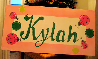
Kylah's Ladybugs


Oh, this one turned out so sweet. I am so loving this font...just look at that big K and that pretty y. Some letters and names just flow together so well on the first try and others I work on for hours. I did the name a little larger than I usually do so that it comes out over the pink border. I think I like it!
The pinks and greens compliment each other beautifully. I just couldn't put black on this one, so instead I used a dark gray with plenty of white accents. Thank you, new customers Justyne and Kylah. I hope you like it as much as I do!
The pinks and greens compliment each other beautifully. I just couldn't put black on this one, so instead I used a dark gray with plenty of white accents. Thank you, new customers Justyne and Kylah. I hope you like it as much as I do!
Comments